Fusing living modules creates the effect of spatial expansion; this ideal became the
driving force of these two exemplary interior remodels, each measuring in at 110 square metres. Internal non-structural walls were ripped out to begin anew, with living room layouts reimagined into fluid multifunctional spaces. Bedrooms and bathrooms have been transformed too, with hi-end furniture, fixtures and unique touches to personalise and define. Cohesive decor binds the rooms of these fresh home plans together as one sophisticated concept, threading common colour and materials throughout. Our contrasting schemes begin with a scene of deepest green and black, and end in sunlight bleached white and wood tone.
Designer: GSK design
In St-Petersburg, Russia, our first 110 square metre home remodel has opened up a fluid living space that pulls natural light from two large windows. The decor darkens the space with shades of grey, black, bottle green, and dark tan. Sections of concrete leave a raw industrial essence, which counterbalances sleek modern elements and soft cushiony furniture.
The renovation included the custom creation of a new window seat in the lounge portion of the open plan.
An Eames lounge chair ups the sophistication factor in the furniture arrangement.
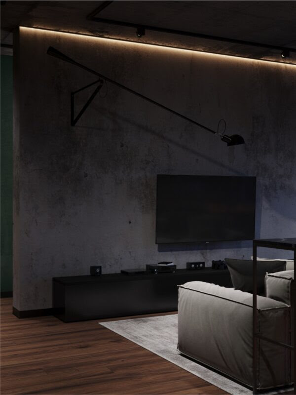
A ribbon of light highlights a concrete feature wall from the ceiling seam, whilst a TV unit strikes a dark black underline along its base. A silver grey rug provides a light base for the lounge, elevating it from the shadows.
Ceiling and structural walls carry the concrete element.
A black marble bar runs along the back of the sofa, with kitchen bar stools tucked beneath. A formal dining set stands to the side of the room, to benefit from the vista.
Tan swivel chairs complement the rich wood tone table. A bottle green kitchen backsplash glows mysteriously from a black one wall kitchen.
The deeply cushioned window seat draws attention to sweeping city views, and makes a perfect reading nook.
Bottle green decor carries through from the kitchen into the hallway of the home, where colour matched doors make one sleek swathe of colour.
A wool throw lays the dark green decor accent down in the bedroom. A modern wall sconce highlights a fluted gypsum headboard panel.
A square tray top bedside table contrasts with the wall light’s circular motif.
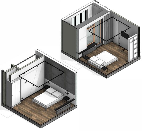
Black skirting boards sharply trim the pale grey and white scheme.
Black track lights evenly distribute light around the full perimeter of the room.
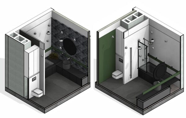
Dark green decor spills into the bathroom across a solid feature wall.
The vanity area is clad in deeply textured stone tile, which is showcased by the glow of a backlit vanity mirror. A unique metal vessel basin gleams on a stainless steel countertop.
The faucet is mounted onto a green strip that borders the entire wet zone. The decorative strip morphs into a useful storage shelf by the over-bath shower.
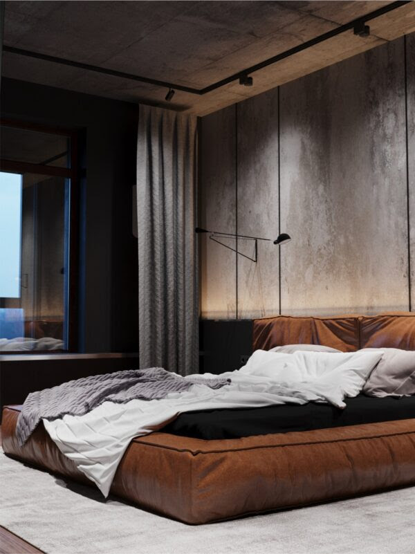
The tan leather element introduced via dining chairs in the living area is translated into a cushioned bed frame in the second double bedroom.
Concrete panels make a raw backdrop.
A swing arm wall lamp extends over each side of the luxury platform bed.
Each of the bedrooms benefit from a private enclosed balcony space.
The second bathroom in home to another bottle green and black affair.
This time it’s a unique bathroom sink that brings in the rugged stone element.
Recessed spotlights dot the ceiling.
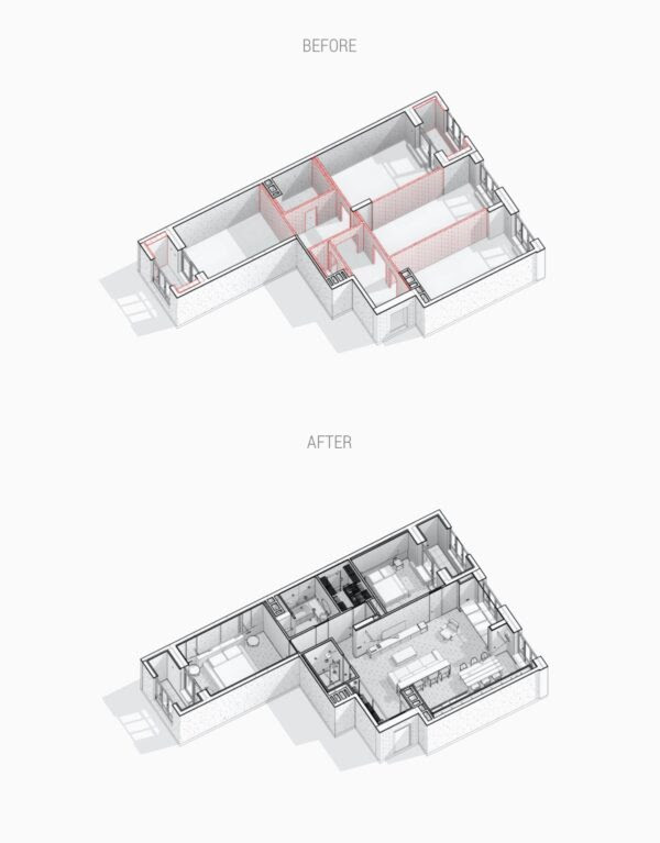
Perspective drawings of before and after the renovation process.
Visualizer: Nitton architects
This 110.0 square metre home in Singapore was born out of aspirations to create a mini house out of a basic flat in a high-density 800-unit public housing development.
Maximum potential was unlocked by removing all of the non-structural interior walls. The new uplifting open plan feels like it has fresh breathing space for the homeowners and their family. Sliding partitions facilitate a changing layout throughout the day, reforming the floor plan to suit different routine needs.
For the children of the house, the fluidity, scale and interactivity of the space stimulates play.
This is a house filled with music and literature. A turntable and speakers await selection by a stylish lounge chair…
The bookcase offers something more than meets the eye: with a gentle push, the bookcase reveals itself as another moveable partition.
Indoor plants grow an atmosphere of relaxation and rejuvenation. Mobile self-watering pots within fixed planters allow for plants to be easily moved around and repotted.
Moving partitions and a full height glass wall allow the bedrooms to form part of the larger living space. A pull out bed is rolled away under the deck of the indoor garden, whilst the other folds away into the wall to clear floor space during the day.
Bean bag poufs make lightweight portable seating. The master bedroom on the other side of the glass wall is accessed via the indoor garden, which replaces a typical hallway.
Inside the master bedroom, a row of wardrobes section off a vanity area. A steel frame lifts the cabinets off the floor to allow natural light to filter through the space. By relocating the wash basin to the outside of the ensuite, there was room to install both a bathtub and a large shower enclosure within. In its entirety, the new spatially layered layout extends the visual depth of the apartment, accentuated by an endless flow of natural daylight.











Комментариев нет:
Отправить комментарий